
If you’re after ROI, email marketing is difficult to compete with. Once you’ve subscribed to your MA platform of choice, you have a data-driven tool that can work around the clock and reach users on a 1:1 level. But like all powerful tools, you’ve got to ensure you’re using it properly.
To give you a helping hand, we’ve rounded up three of our favourite tips for building more effective B2B marketing emails.
There’s a fine line between a click and a delete. High quality creative can often tip the balance, and certainly a lot of the best-practice email examples you’ll see feature stunning visuals.
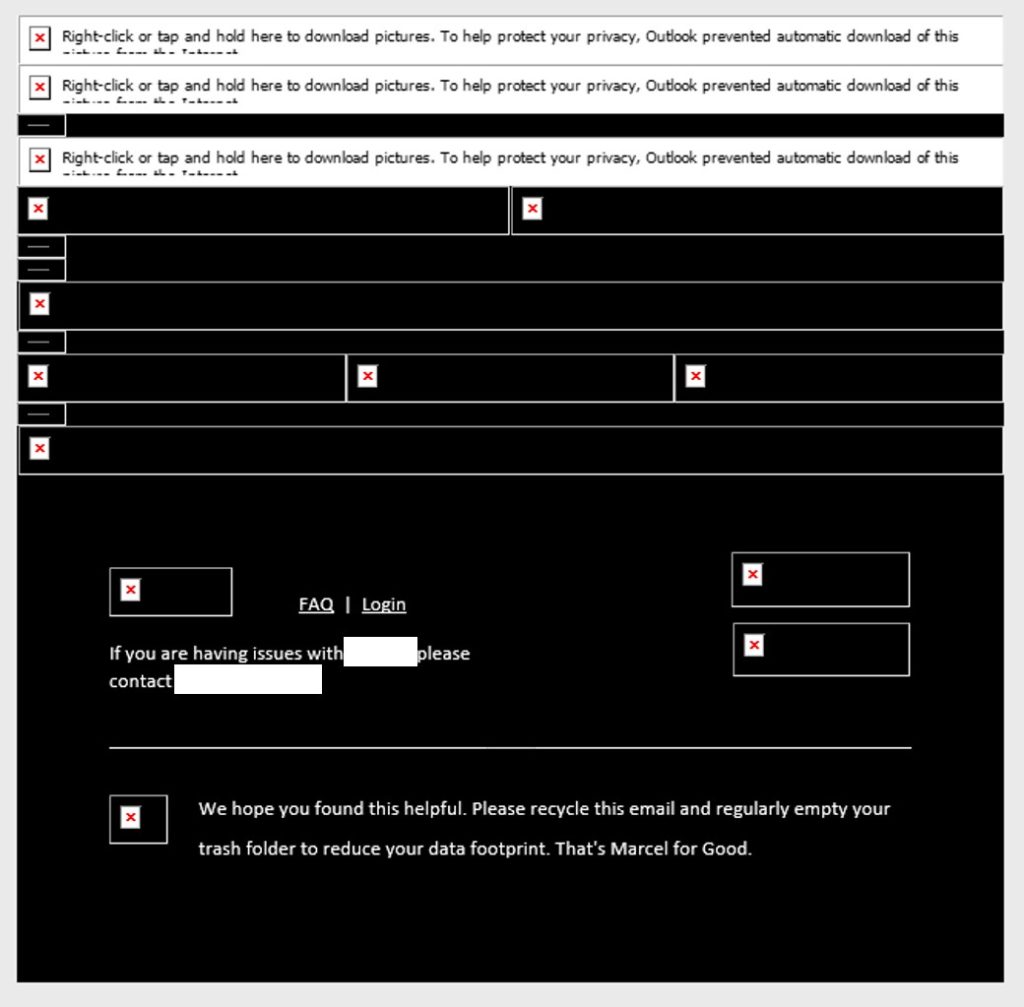
However, in a B2B context, many recipients won’t see the design you worked so hard to produce. A lot of the top business email providers, including Outlook, block images from downloading by default to protect employees against cyber threats and cater to lower bandwidth users.
In a best-case scenario, you may lose a banner image or the CTA button – but in design-heavy examples, image blocking can render your email meaningless unless the recipient specifically opts to download images.

The takeaway here: if you’re including imagery within your email then assume a portion of your audience won’t see it. If a message is important enough for inclusion in your banner image or wider design, make sure it’s front and centre in your copy too. Similarly, if you’re relying on a CTA button to drive clicks, make sure the place you’re driving to is also hyperlinked within the copy.
It’s said the average human now has an attention span of around 8 seconds, which allegedly falls below the level of a goldfish. You can see how this might hinder the effectiveness of your marketing emails, especially considering employees receive an average of 121 emails per day.
If you’re going to cut through the competition and reel in your goldfish, you’ll need to make this shortened attention span work in your favour. The rule to remember here is concise copy gets clicks.
Concise copy gets clicks
The average adult reads an average of 225 words per minute. Remembering our 8-second window of opportunity, this gives you around 30 words at the start of your email to make an impression. Forget the flowery introduction, make sure the first 30 words reiterate your key message and call to action. If you can’t condense your message into the first 30 words, you’re trying to say too much.
We’d also recommend setting a 100-word limit on your marketing emails for those contacts who do make it past the 30-word opener. An email should offer a taste of what the recipient can expect if they click through, so it’s important to ensure they still have reason to proceed once they’ve finished reading.
Email marketing isn’t an exact science – as much as we’d like it to be. Tactics like the above can improve your formula for developing effective marketing emails, but ultimately different audiences respond differently to different variables. What works for a software provider may not translate for a pharmaceutical manufacturer.
Every email is an opportunity to understand your audience better, and in this respect A/B testing is the best tool at your disposal. A/B testing compares the performance of email variation A against email variation B. It’s a tool offered by all the main MA providers that can be implemented to huge reward relative to setup effort. Easy variables to test include subject line, CTA colour, HTML vs plain text, and copy length.
In the short-term, testing can help boost your opens or clicks, but in the long term, it’s helping you to build a picture of your audience and what appeals to them, especially if you’re keeping track of results over time. Want an easy way to keep track of A/B tests over time? Get in touch and we can share our handy template to track and compare results.
The latest (and most useful) B2B insight, delivered to your inbox.
Publicis Pro needs the contact information you provide to send you the latest B2B insights. You may unsubscribe from these communications at anytime.