
By Louise Brooks
Personal preference tends to prevail in matters of beauty, whether it’s the type of person you find physically attractive, or the kind of view you’d like to see from your hotel window.
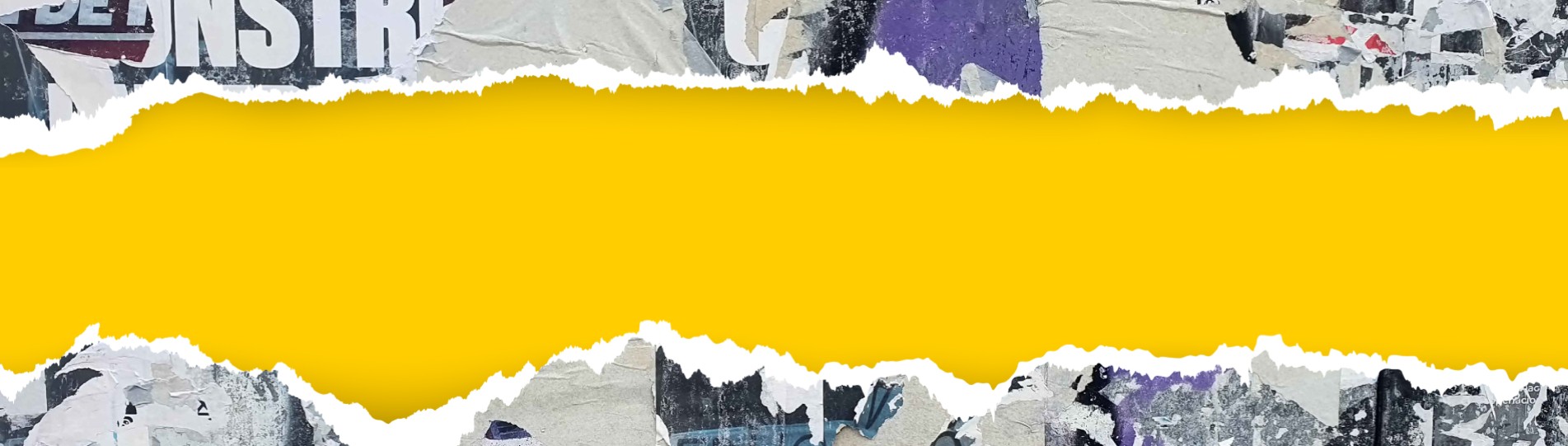
Yet for design, this is not quite the case. There are rules! Like the golden ratio, white space, and the rule of thirds. They’re informed by research, by expertise, by rinse and repeat processes and tried and tested techniques. And design rules are very rarely broken.
However, a surprising trend appears to be springing back to life: anti-design.
Originating in the 1960s as a counter movement to the effects of mass consumerism, its proponents felt design should be taken less seriously, and began putting form over function. The term has since become synonymous with anything that stands out as bolshie, haphazard, or distorted: in other words, ugly.
Now, ugly is a loaded word. Yet within this movement, it’s reclaiming its power. Here, ugliness is not simply the opposite of beauty: it’s a deliberate design choice. And brands and businesses are putting it to use in interesting ways.
What’s considered ugly is a construct of sorts: dictated by its surroundings, the world it inhabits, the function it serves. It shifts and evolves in line with macro and micro trends, economic conditions, and cultural influences. Graphic Designer Milton Glaser summed this up in a 2016 interview with Architectural Digest, saying: ‘no colour can be preferred or not preferred in isolation. Every colour is in context to another colour’.
The Australian government put this theory into practice in a 2012 attempt to put off smokers, using the most unappealing colour they could find on cigarette packaging. They settled on Pantone’s 448C, more snappily known as Opaque Couché, and described as ‘looking like death, filth, lung tar, or baby excrement’. Yum.
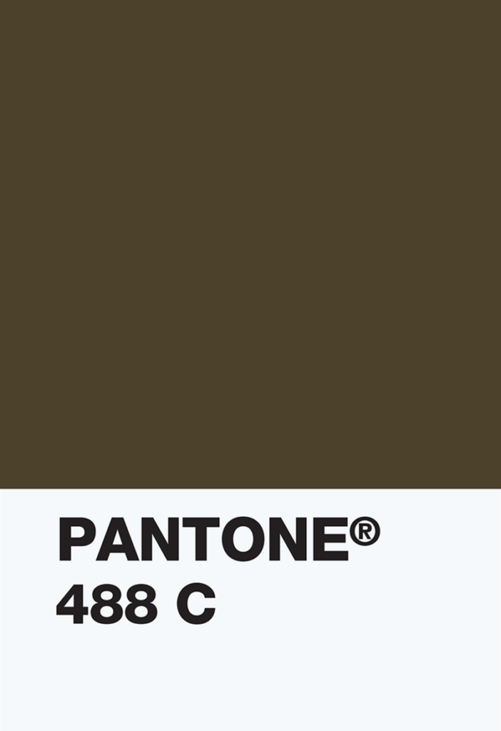
Today, a very similar palette is the interiors trend du jour. Although not ‘pretty’, muddy browns and earthy mustards are certainly comforting – or at the very least, cocooning. In a deeply distressing world full of pain and anguish, why can’t we paint our living room Opaque Couché? Why not drench our personal sanctuaries with the colour of baby shit to escape from it all? Give us one good reason!
Yes, yes, this again. But you will be hard pushed to find a better contemporary example of ugliness in the mainstream than the anti-aesthetic trend of 2024.
Although embodied as a state of being – a delicious, messy vibe – pop singer Charlie XCX’s brat also came with a lurid lime green backdrop, commoditised by everyone from vegan bratwurst brand Field & Roast to the US election campaign (and even a B2B marketing agency leaping aboard the bandwagon).
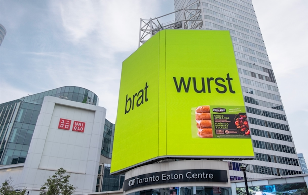
Teen Vogue effectively captured the sentiment: ‘the image attached to Brat embraces elements traditionally considered anti-fashion – ugly even’. Developed in tandem with Dinamo Typefaces (fair play to them getting paid for it), Charli XCX’s iconic album cover was a deliberate move. ‘We chose a green that felt very off-trend. Something that didn’t ooze “taste”,’ said the artist’s Creative Director Imogene Strauss.
As pioneering as brat was, it didn’t exist in a vacuum. It came as a direct result of something else: rebellion against the Clean Girl aesthetic. Characterised by slick buns, oversized water bottles, and an obsession with wellness, Clean Girl was the action that brat had an equal and opposite reaction against.
The change was palpable, and to an extent personal. I could never quite be arsed with the performative perfection of Clean Girl, yet the relaxed self-expression of brat felt attainable. With brat, you can be a dumb, messy bitch – and that’s okay! Encouraged, even!
Of course, the pop culture world runs hotter than B2B marketing, but the idea of ugly design being a way to upset the status quo is an interesting one – if not new.
Ugliness as a method of rule-breaking made its most prominent cultural leap through the attitude and aesthetic of punk bands in the 1970s. Interestingly, despite the otherness of its origins, I’d now regard ‘punk’ as a term of endearment. I guess painting a wall shit brown is sort of punk. And brat definitely is. But could something as mundane as dog food packaging be punk?
Well, yes. Check out Gentle Giants. Both the website and packaging design features an explosion of wildly varying typeface, pixelated photos of the founder’s wife and children, and An Excessive Use of Title Case. It’s garish. It’s kitsch. It’s UGLY.

One look at this and I’m transported back in time. It’s 2003. I’m sat in front of a computer almost the same size and weight as me. I’ve pressed the giant round button on the processor, listened to the melodic modem dial-up tone, and – anywhere from five minutes to two hours later – I’m ready to surf the net.
But this isn’t really about nostalgia; even if that’s an enjoyable side effect. It’s simpler than that: there’s no other pet food on the shelf that looks like it. And it works. Gentle Giants has been going strong since 1994, has featured on US talk show Ellen, and is stocked across American retail giants like Walmart, Target, and Petco.
What’s great about Gentle Giants’ ugly branding is that it’s memorable for being unexpected. Engaging with users in new ways can be challenging, especially in ultra-competitive markets. It also aligns perfectly with the brand story; it’s clear the founder has a big personality and cares deeply about dogs. No matter your industry or audience, ugly design must mirror what your brand stands for to effectively resonate.
Run rate marketing is arguably the antithesis to ugly design. It’s formulaic rather than chaotic, predictable rather than brazen, functional rather than fun. But just as ugliness is not the opposite of beauty, boring doesn’t have to be the opposite of exciting.
The reason the least successful B2B campaigns fall flat is that agencies often fail to gain the level of trust that’s critical when people’s jobs are on the line. What do B2B audiences care about the most – on a personal level? Looking good in front of their boss. Whether you’re an IT decision maker choosing a new software solution, or a 22-year-old deciding on which clothing brand to buy from, we’re all ultimately driven by our own selfish needs.
This is great news, though: it means that the boundaries are not as stringent as we think. We’re already seeing some really outside-of-the-box stuff, from Teamwork.com’s The Client to Salesforce’s Candy Shop. So it seems likely that the best B2B campaigns will embrace ugly. Bringing in some of that brazen brat fun is within reach.
To add to this, one track we should collectively avoid is that ‘B2B should be more B2C’. The gulf isn’t so wide; it’s all people selling products to people, whether tangible or abstract. The question is more about risk, and how far we push the limits. It’s our responsibility as creatives to take the lead here: to hold our clients’ hands and tell them everything is going to be okay – before we change their logo typeface to Wingdings!
I’m not saying legacy finance brands should tear up the design rulebook and vomit slime green all over their branding. Just like Gentle Giants, it’s about engaging with users in unexpected ways. It’s about breaking some rules here and there.
Publicis Pro’s Senior Designer Pierre Mazurier thinks it’s about finding that perfect balance. ‘The push-pull relationship between the status quo and rule breaking has to work in tandem, with one informing the other. The trick is to be open enough to know when the time for rule breaking is. For B2B, as long as the story makes sense for the product – something that’s rooted in research and a genuine need – there is space for it. If a client has a product worth shouting about, it should also be worth ensuring it stands out’.
I think it’s just a matter of time before ugly design trickles through into B2B branding: but maybe in a gentler way, as a response to situational or industry-relevant context. After all, it’s only getting harder and harder to stand out from the crowd. Something’s got to give.
For me, choosing chaos almost means there’s less to lose. It’s the ultimate way to subvert the market and find the white space every brand is looking for. Much like how a colour can be so off-putting it stops people buying cigarettes one year, yet not long after we’re painting our walls with it, B2B branding could soon see the tides turn away from homogeny in favour of ugliness. And I can’t wait.


The latest (and most useful) B2B insight, delivered to your inbox.
Publicis Pro needs the contact information you provide to send you the latest B2B insights. You may unsubscribe from these communications at anytime.